# Visualizing Metadata
## Overview
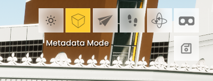
The Metadata Mode feature introduces an interactive and intuitive way for users to explore metadata associated with individual components of a building. When activated, users can click the **Metadata Mode Button** to enable this functionality. Key features include:
* **Component Interaction:** Users can click on specific components of a building to reveal associated metadata.
* **Highlighting:** Components with metadata are visually highlighted when Metadata Mode is active, making it easy to identify which parts of the building contain additional information.
* **Metadata Display:** Upon clicking a highlighted component, a list of metadata keys and values is displayed, allowing users to easily browse and locate the information they need.
This tool streamlines the process of accessing and managing building metadata, offering a user-friendly experience for navigating complex datasets.
## How it works
**Viewing Metadata**
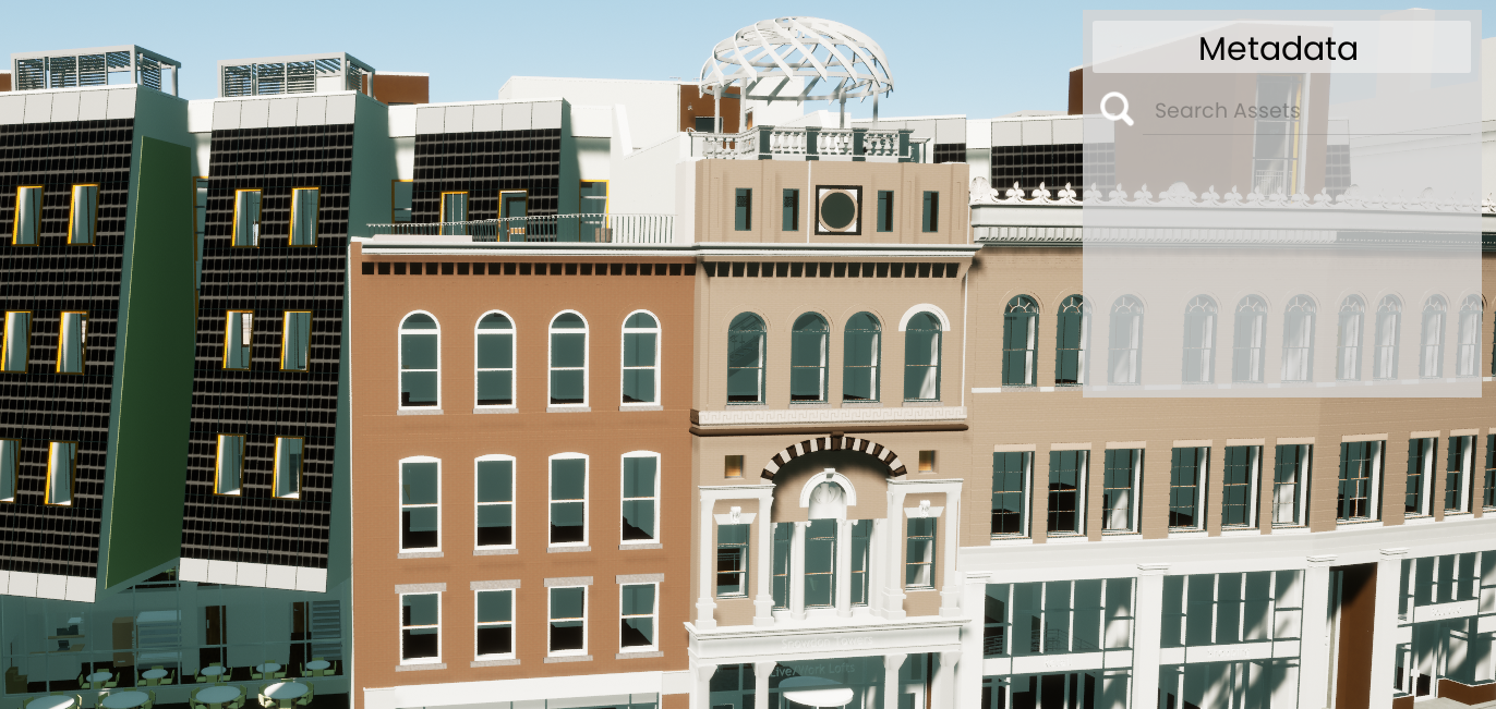
To access the metadata for a tileset or building, navigate to the desired structure. Once there, click the **Metadata** button located in the top-right corner of the screen. This action enables Metadata Mode, allowing you to explore detailed information associated with the building components.
**Metadata Display**
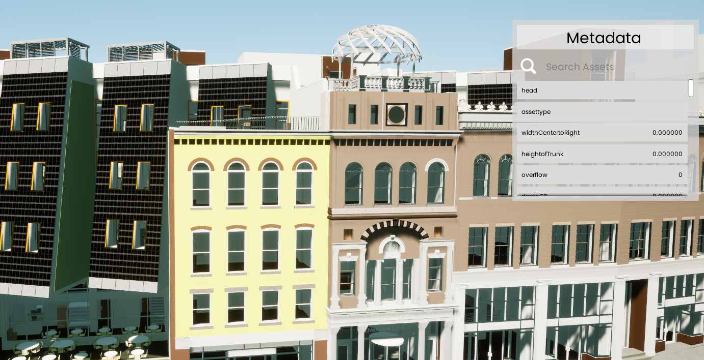
After clicking the **Metadata** button, a widget will appear on the right side of the screen. This widget serves as the display area for all metadata associated with the selected component. It organizes the data into property labels and their corresponding values, making it easy to browse and understand.
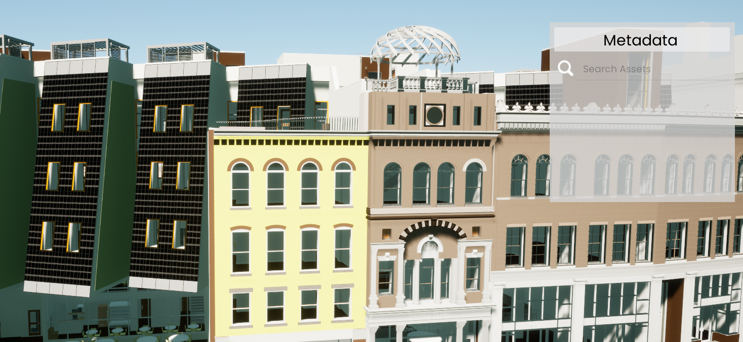
**Hovering Over Components**
You can hover over any component of the building with active metadata to easily identify and view the associated information. This feature allows you to quickly determine which components contain metadata without the need for additional clicks.
**Interacting with Highlighted Components**
When you click on a highlighted component, all metadata associated with that component will be displayed in the widget. You can scroll through the list to locate the specific property and value you need. To unhighlight the component, simply click anywhere outside the highlighted area.
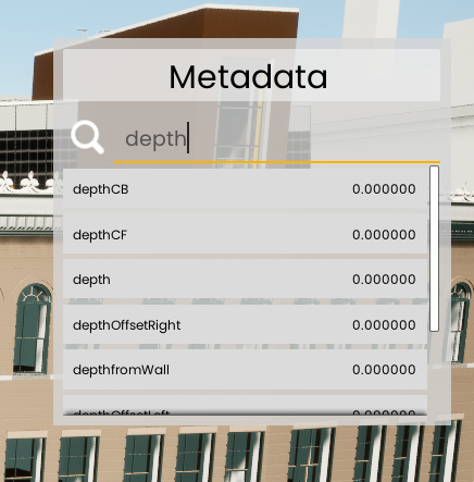
#### **Search Bar**
At the top of the interface is a search bar for filtering metadata labels. As you type, the labels dynamically update to display only those containing your input. Clear the search bar to reset the list and view all available labels.
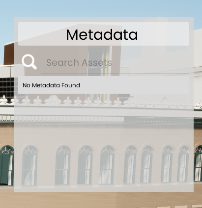
**No Metadata Found**
If you click on a component that does not have any associated metadata, a message will be displayed indicating that no metadata was found. This ensures clarity and helps users distinguish between components with and without metadata.
**Work in Progress:** Currently, we are considering adding a filter feature to remove irrelevant information for a more streamlined experience.
---
# Agent Instructions: Querying This Documentation
If you need additional information that is not directly available in this page, you can query the documentation dynamically by asking a question.
Perform an HTTP GET request on the current page URL with the `ask` query parameter:
```
GET https://docs.aeroai.io/siega-features/other-features/visualizing-metadata.md?ask=
```
The question should be specific, self-contained, and written in natural language.
The response will contain a direct answer to the question and relevant excerpts and sources from the documentation.
Use this mechanism when the answer is not explicitly present in the current page, you need clarification or additional context, or you want to retrieve related documentation sections.